Helping a telecom company boost smartphone sales by improving navigation experience
UX Research | UX/UI Design
Project Overview
During the launch of a new campaign, WindTre’s marketing team needed to highlight some new smartphones in the dedicated shop section. This request put the spotlight on the device’s purchase experience, in which new opportunities for improved navigation and communication were identified.
My Contributions
As lead designer for thefaculty, I also worked at partner projects like this one. This project required to integrate Dubai’s design guidelines with the Design System I created for thefaculty (since the contest had to take place inside of the App).
Identyfing main issues
WindTre
Jul 23 – Sept 19
Shop navigation
Imagine yourself wanting to buy a new smartphone at an electronics shop. You do some research online on the model you would like, enter the shop, arrive in the phone department, and find yourself in front of a shelf where hundreds of unopened boxes are displayed, arranged in no particular order. You ask the clerk, and the only thing he can do is pointing boxes of brands you’re interested in, without helping you find the model, memory or colour you want.
This is the experience of a user browsing WindTre’s website. The smartphone showcase is a wall of 50/60 cards that can only be filtered by brand (and other parameters that do not, however, help identify phones) without sorting or grouping.
There is no search function, so users have to scroll to the end of the list to check whether or not the phone they are looking for is listed. Filters can certainly reduce available choices, but not all users notice or use this feature.
Bundle selection
Lorem ipsum
Gathering data & insights
WindTre
Jul 23 – Sept 19
After identifying usability problems on the shop page, I wanted to check whether the data supported my initial assumptions. Without a budget to conduct usability tests, I opted for browsing data analysis using Hotjar.
Session recordings revealed that many users were scrolling up and down the showcase page for an extended period, looking for items of interest. Without any help in finding the desired information, some sessions lasted up to two minutes.
Furthermore, once users had found a phone they liked, they discovered details such as colours and memory capacity only after entering the product page.
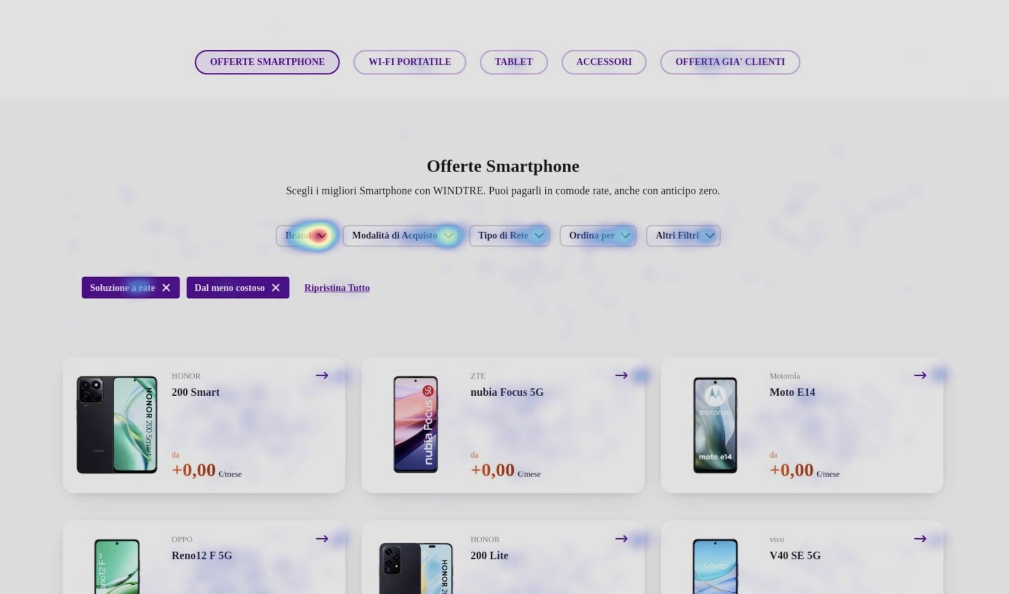
Heat maps provided further evidence to support the hypothesis that users were searching for specific phones: the most clicked item on the entire page (16% of clicks) was the ‘Brand’ filter, the only real help available.
Heat map showing most clicked elements. The “Brand” filter has the highest interactivity score on the page.
Project impact
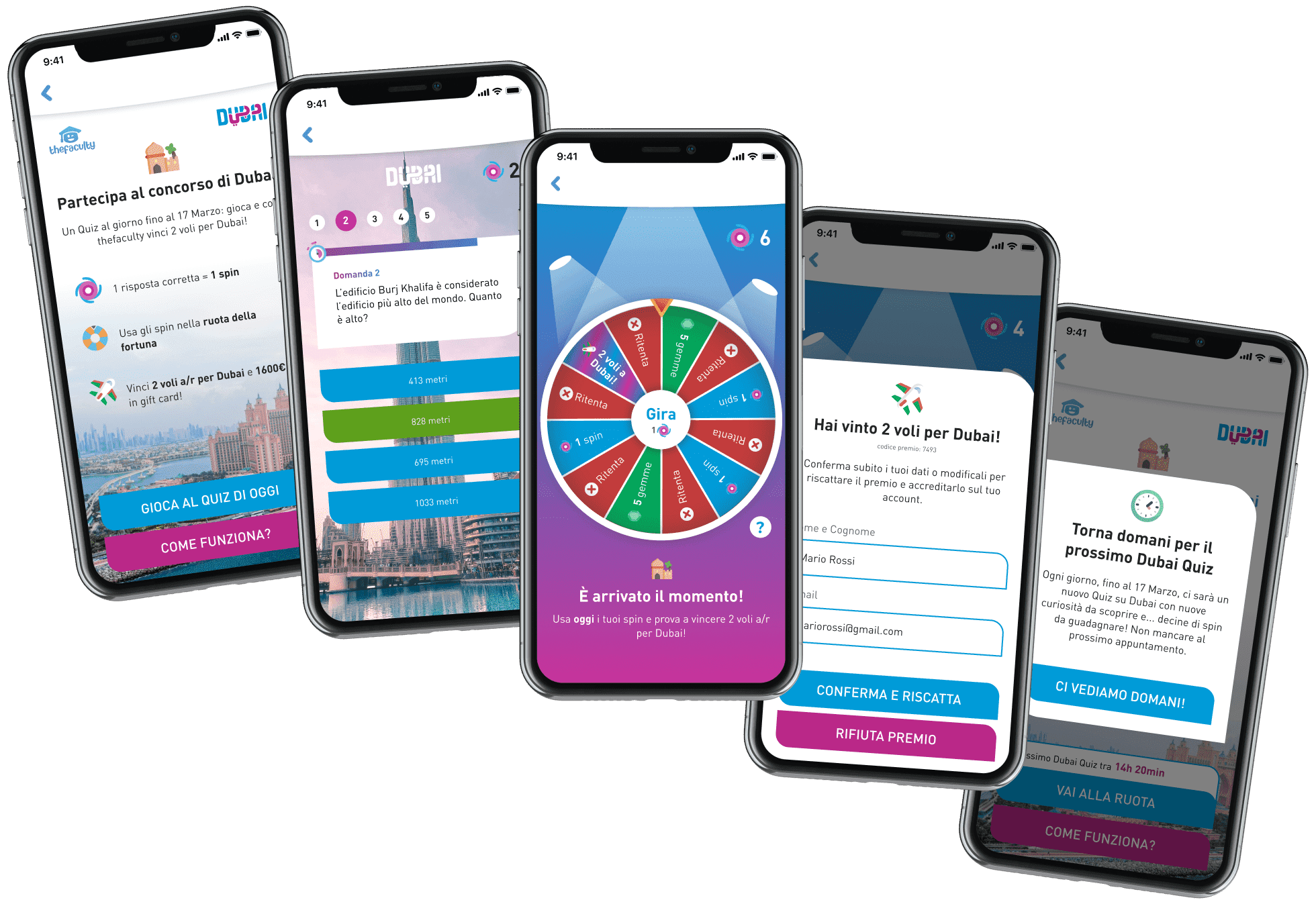
Dubai Quiz
Jan 2022 – Mar 2022
At the end of the campaign we engaged thousands of users and distributed over 125 prizes.
quizzes played
0k+
over a period of 3 weeks
total players in app
0k
took part to the initiative
retention after 3 weeks
0%
1 in 5 users played every day for the whole duration of the contest
Want to work together?
If you like what you see and want to work together, drop me a line!